Radiant cooktopS PORTFOLIO
North America | Senior Industrial Designer
Complete redesign of the company’s entire North American radiant cooktop portfolio, focusing on meaningful brand differentiation, development of key new features, and improved craftsmanship.
Brands: Kitchenaid, Whirlpool, Jennair and Maytag.

CONTEXT + OPPORTUNITY
Whirlpool's radiant cooktop portfolio at the time held a solid position of owning 50% of the NAR radiant market. With some key global players such as Samsung and LG entering the US market, the project's goal was to maintain that position by updating the products’ design language and adding key features, with relatively low investment.
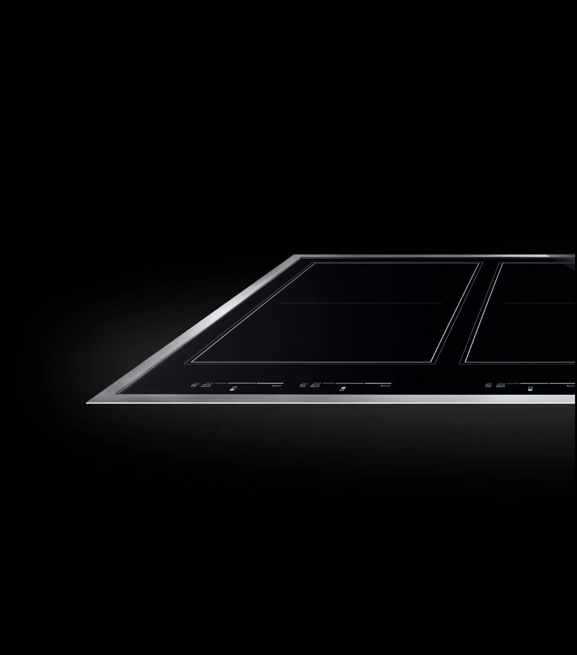
From a design standpoint, however, there was a significant opportunity for improvement. Products in the portfolio at the time all looked the same - a black piece of glass w/ subtle graphic differences, and a slab of extruded aluminum placed over the glass for the more premium models. I pushed the project to explore features that made sense for each brand, this way creating much more meaningful brand differentiation, and providing users with a greater variety of product offerings. In addition, I also worked with engineering to improve overall craftsmanship by re-engineering how the feature was assembled.
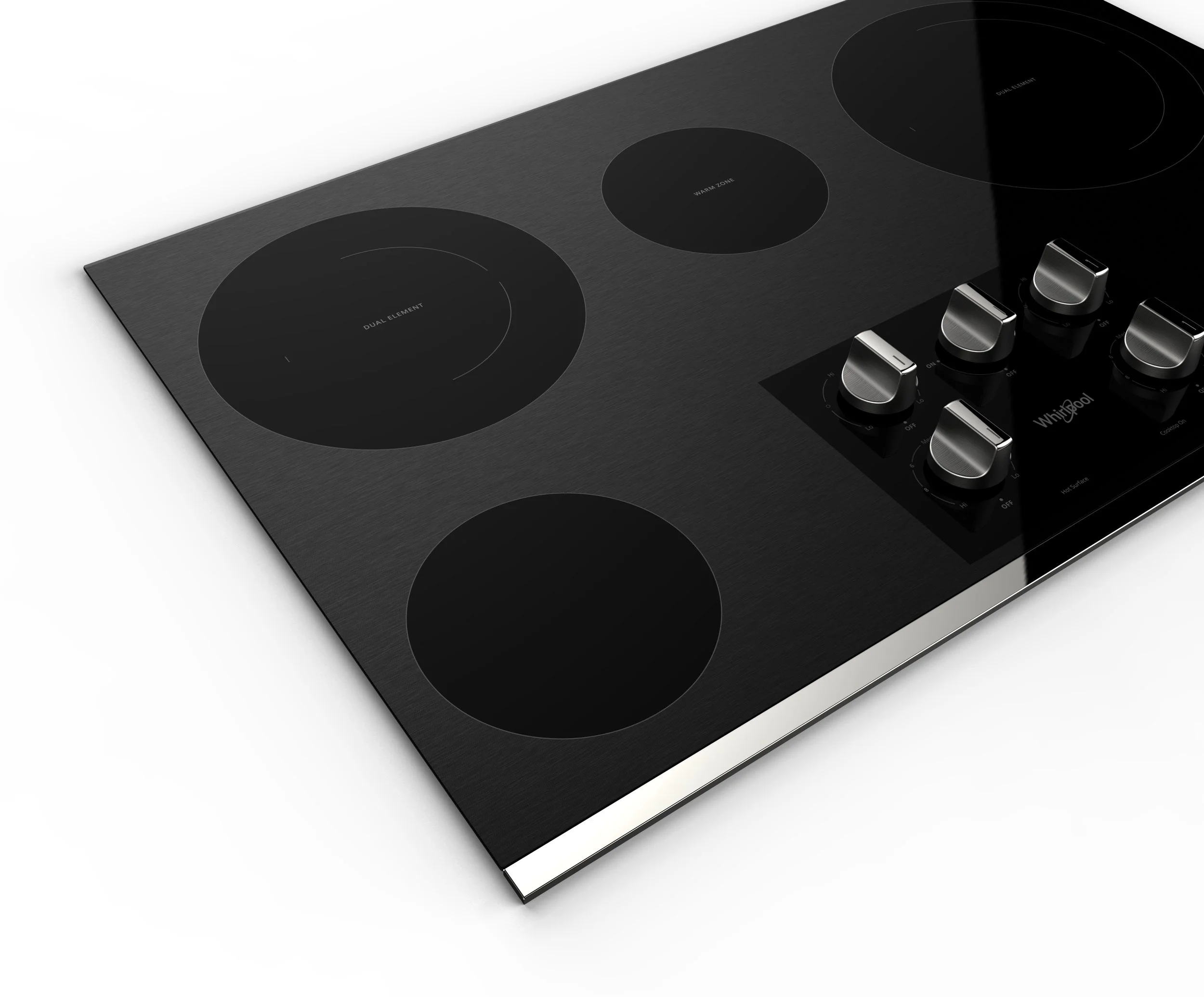
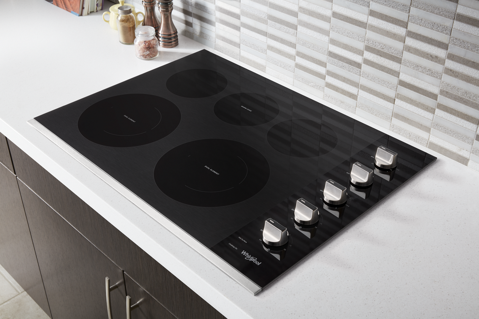
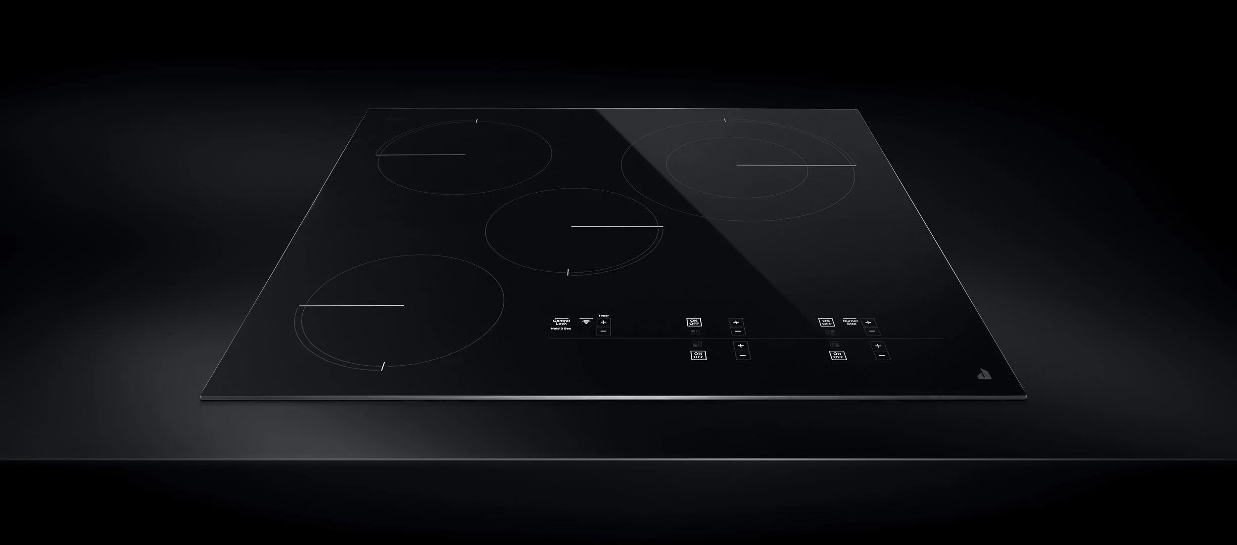
WHIRLPOOL
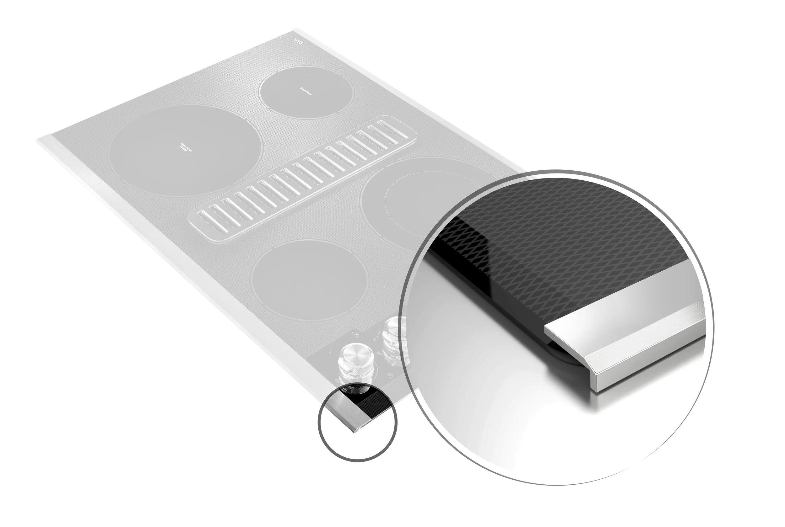
The key goal of the Whirlpool portfolio was to refresh its brand identity with the new global design language. This gave me an opportunity to also improve the craftsmanship, particularly of our trim executions, since this new brand language was all about integration.
As an added bonus, the graphic designer and I also came up with a unique surface finish solution for the glass, creating a stainless steel finish. This immensely enhanced the product's premium feel, differentiated it from core and was highly regarded by users as a way to keep the cooktop looking clean for longer, hiding debris, and scratches from everyday use.
FOCUS AREAS CMF | CRAFTSMANSHIP
New Brand language to match and product suite
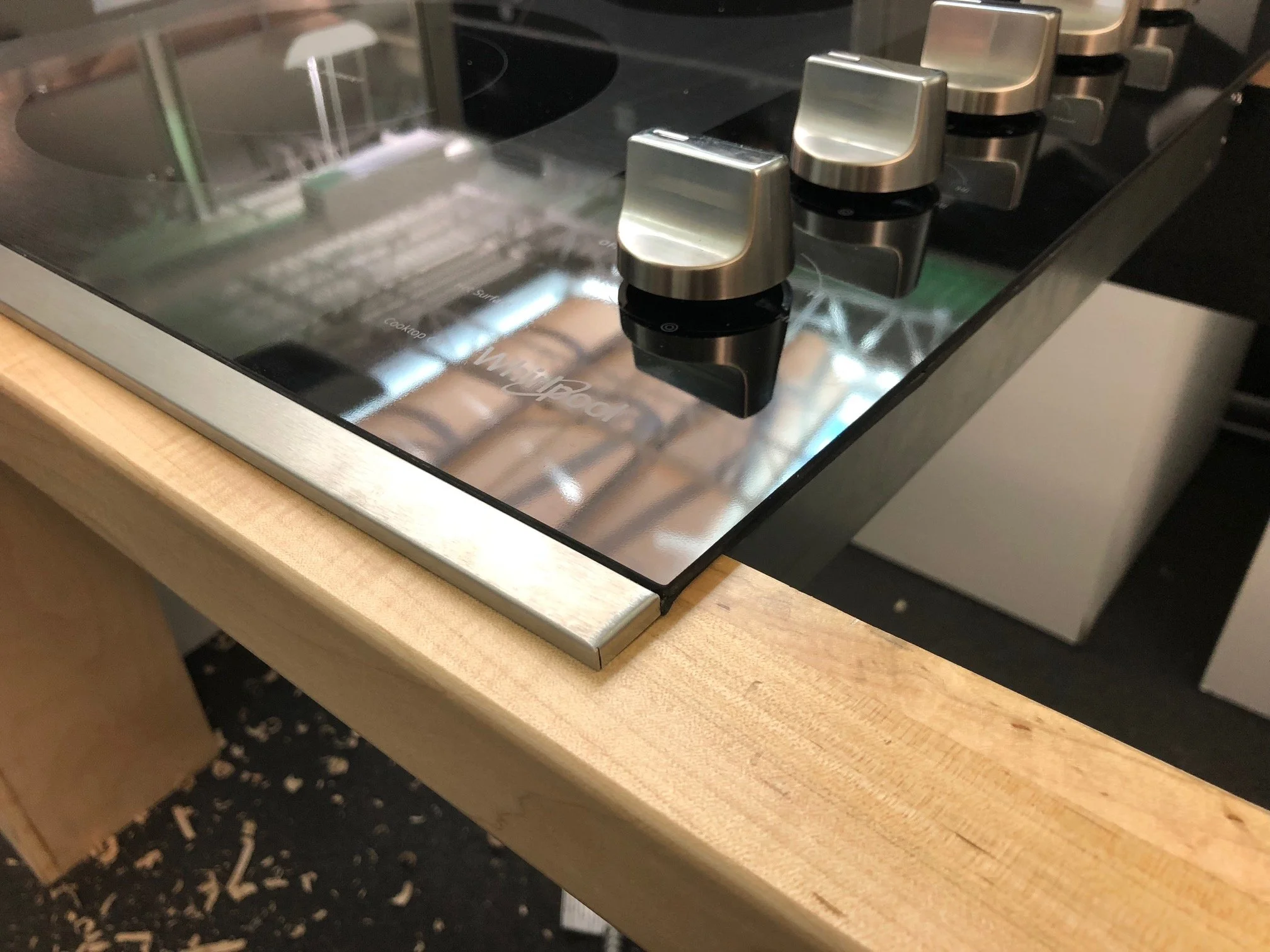
Adjusting Trim Prototype Assembly for Flushness
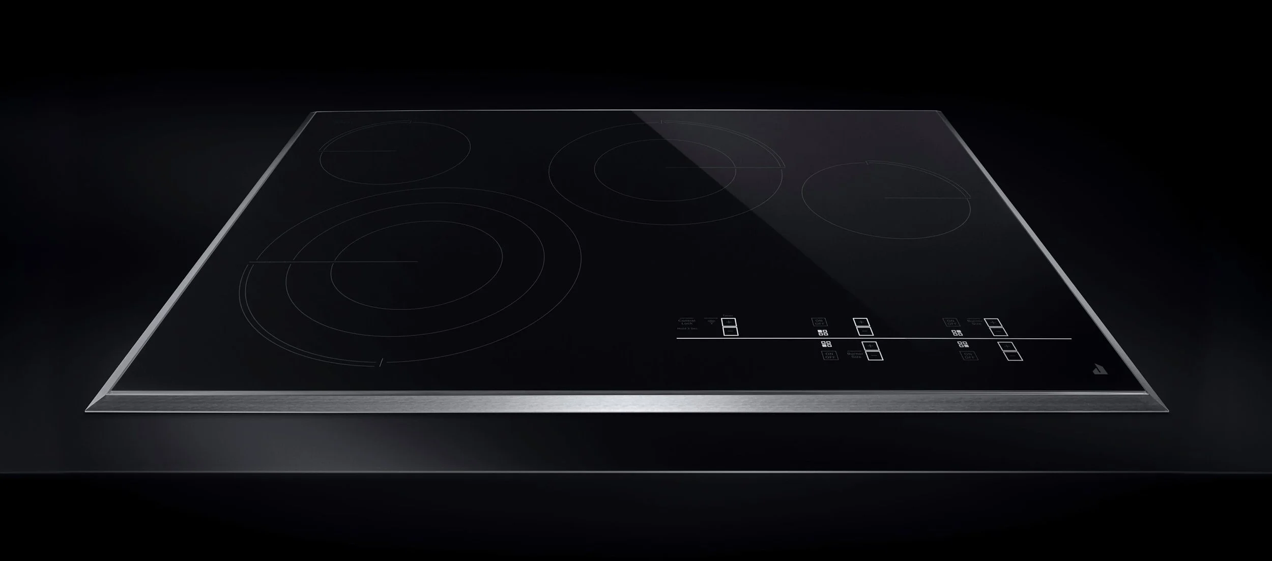
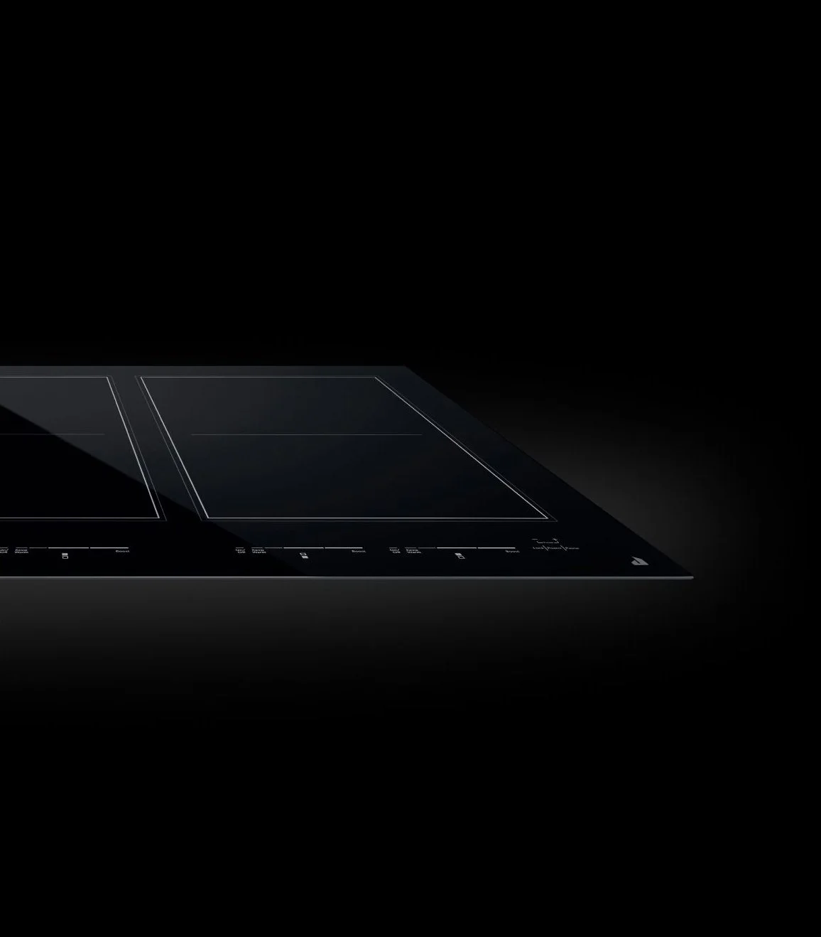
JENNAIR
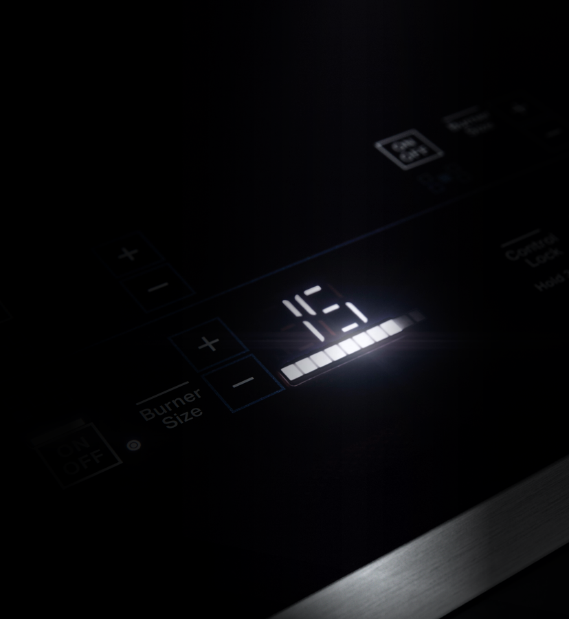
Jennair needed less of a brand language or craftsmanship update, and more of a feature update. Being a premium brand, if Jennair was going to play in the radiant category, we sought out to bring white LED lighting to the products. With the limitation that the glass used in radiant cooktops inherently being red, this had never been done before. We partnered with glass manufacturer Schott to bring white lighting to the radiant category for the first time, by developing a special ink that would cancel out the red color of the glass when shining light from underneath it. On cooktops with knob versions and not touch, we brought on white LED rings under bezels.
FOCUS AREAS LIGHTING | CONNECTIVITY
Accomplishing white LED lighting under the red gradient glass was one of the project wins and toughest technical developments.
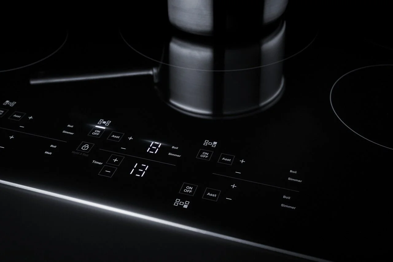
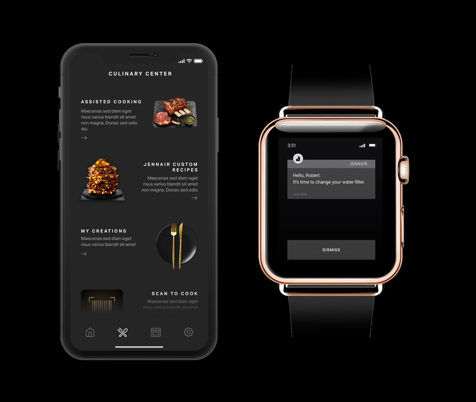
Connected App features + watch notifications
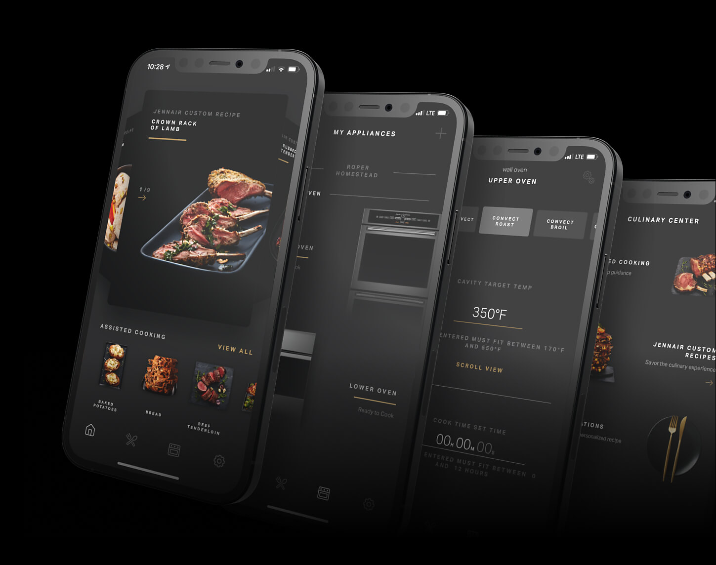
Full Kitchen suite wifi integration
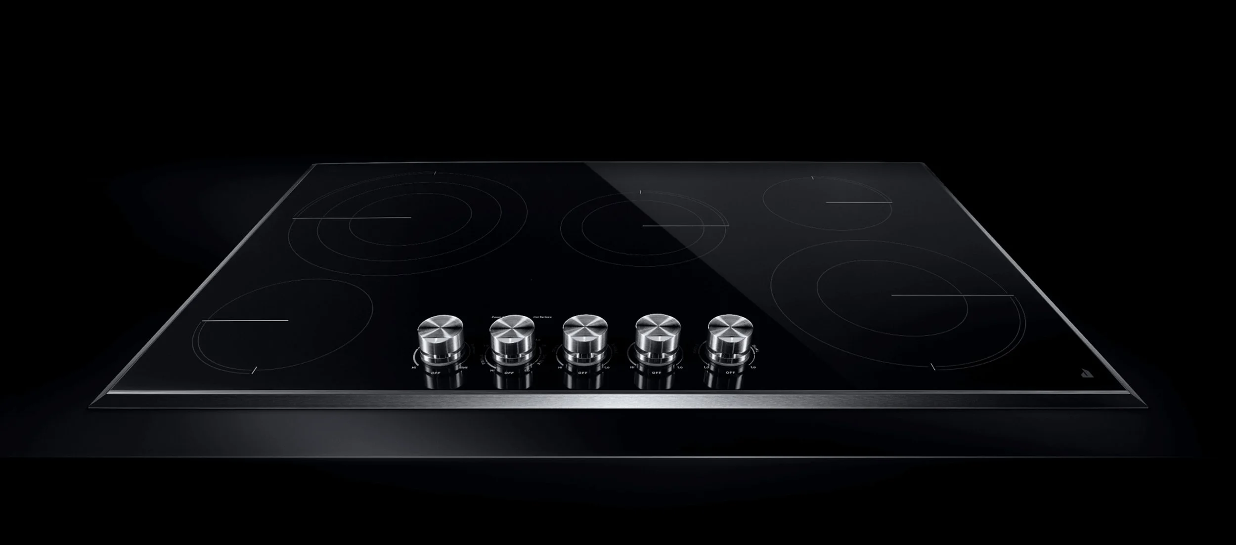
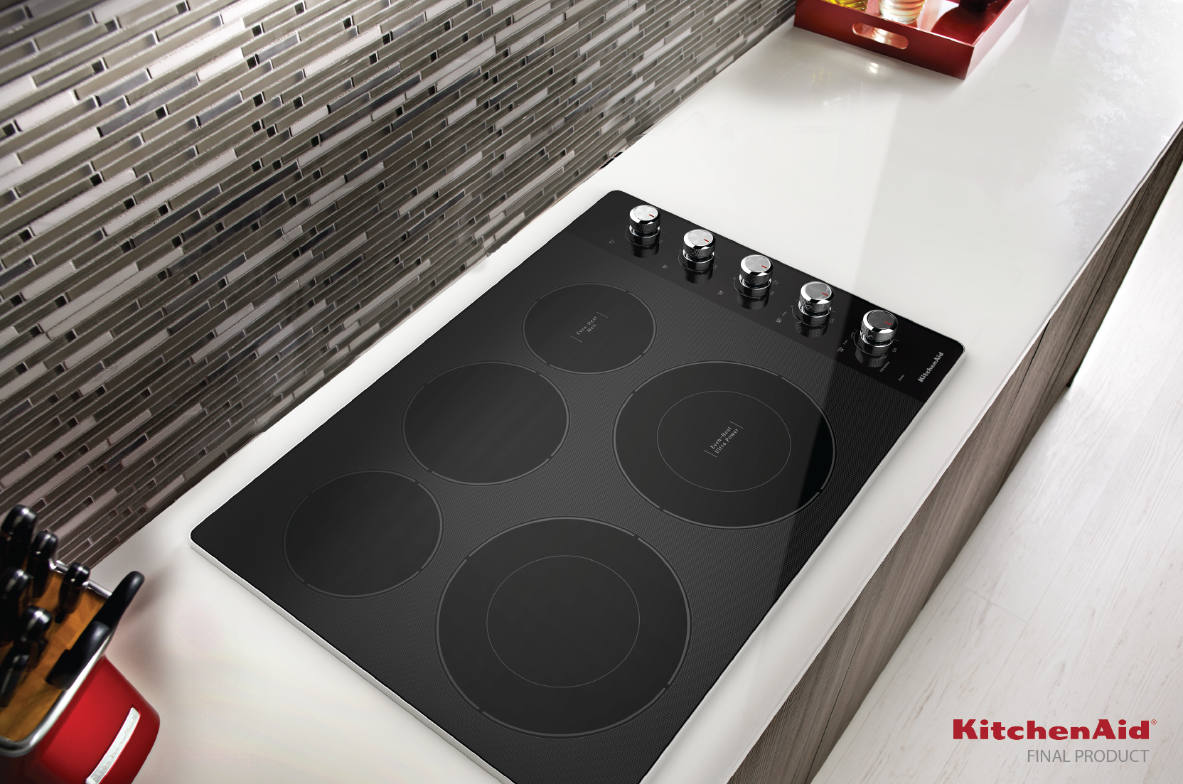
KITCHENAID
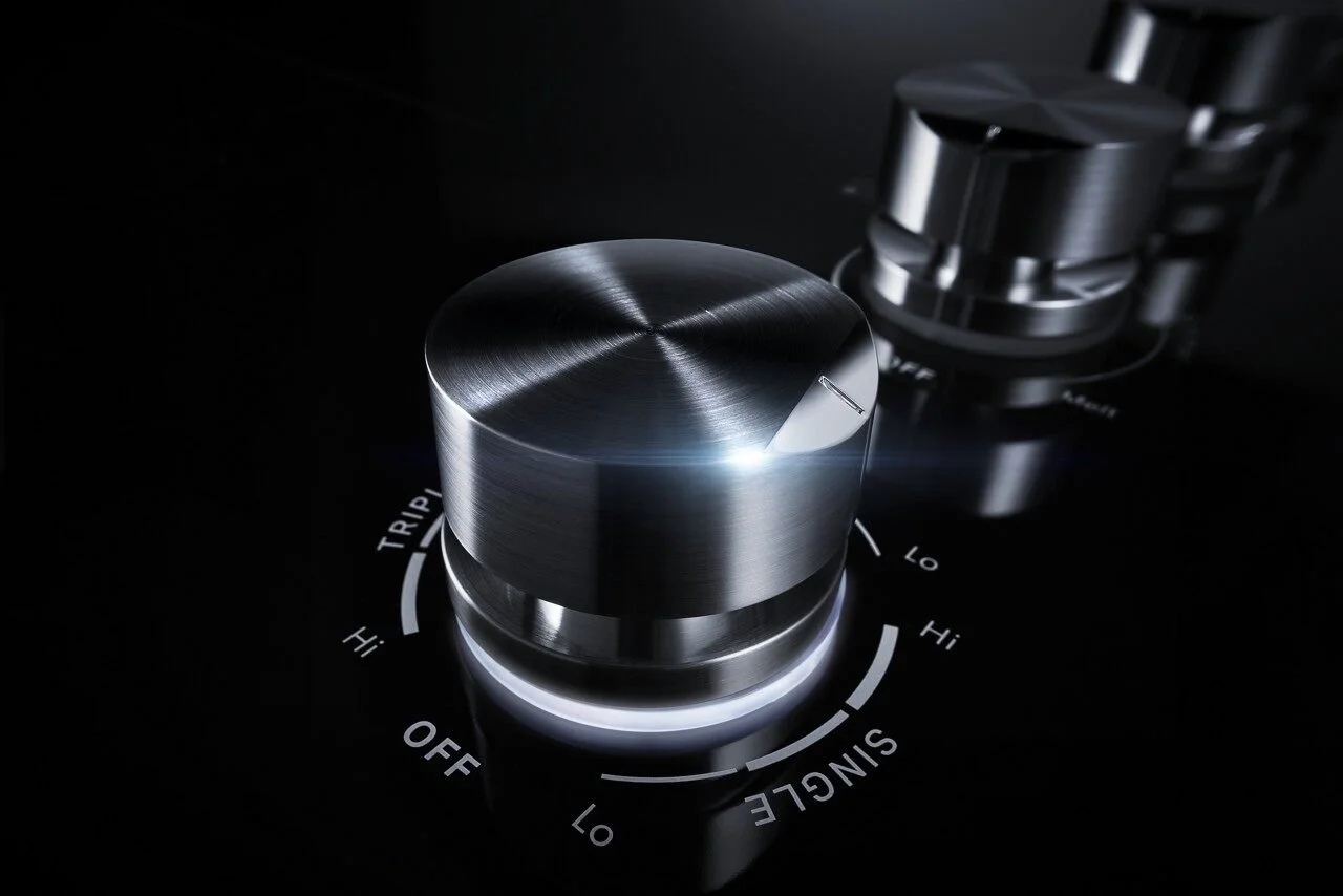
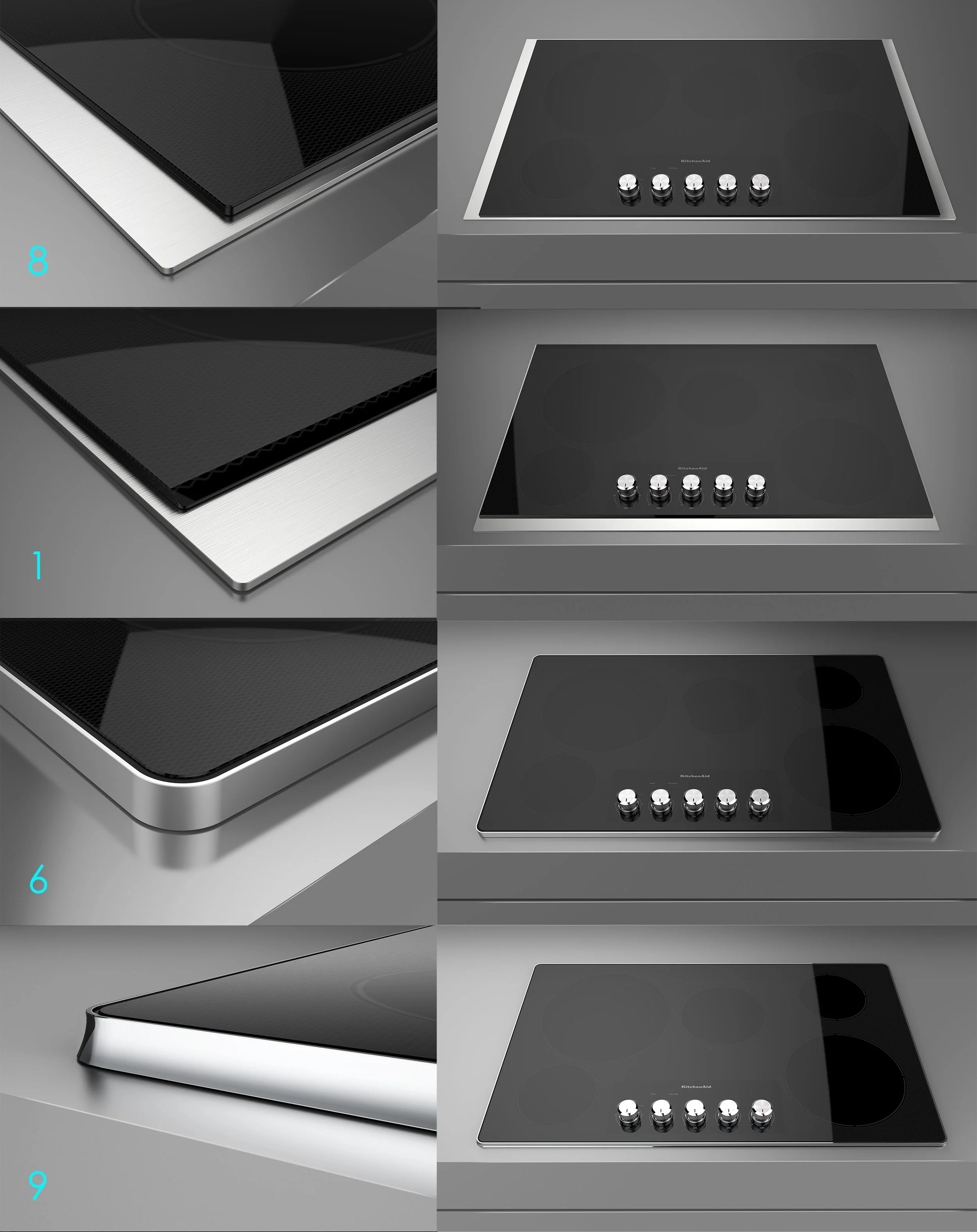
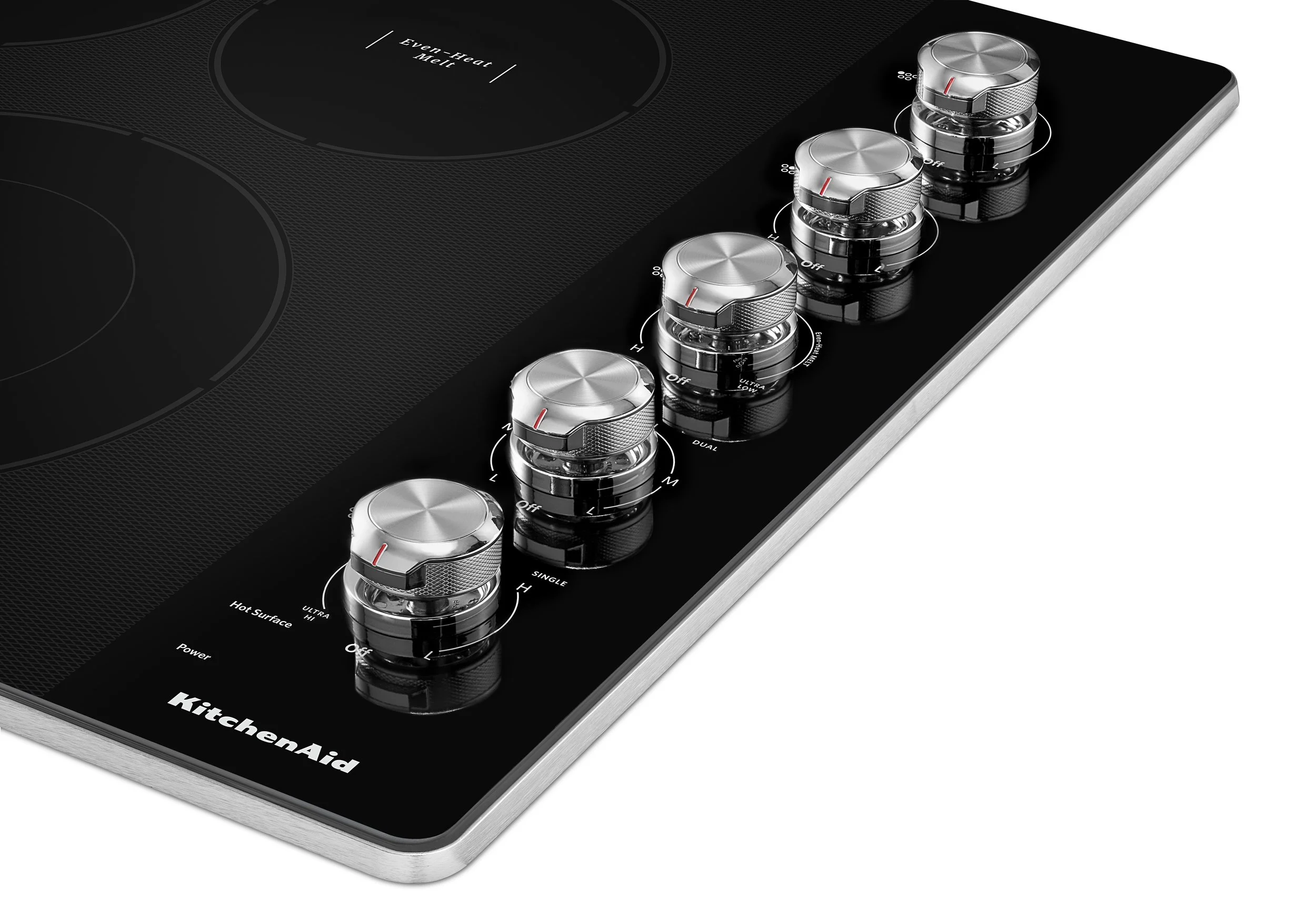
The Kitchenaid brand is less about being flush to its surroundings and more about being proud of the tool.
With this in mind, our focus was to create a much-needed improvement on the stainless steel trim solution, giving it the proper premium finish the brand instilled. A lot of the Kitchenaid development was then focused on exploring different trim solutions that reflected the brand language in its cooktop version, which still asked for some integration to the counter.
FOCUS AREAS IDEATION | CRAFTSMANSHIP
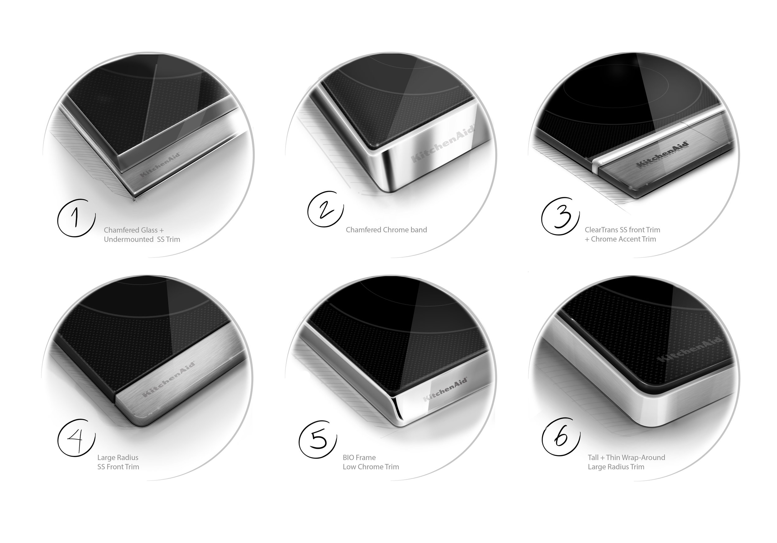
Initial trim solution ideation
full product proportion visualization
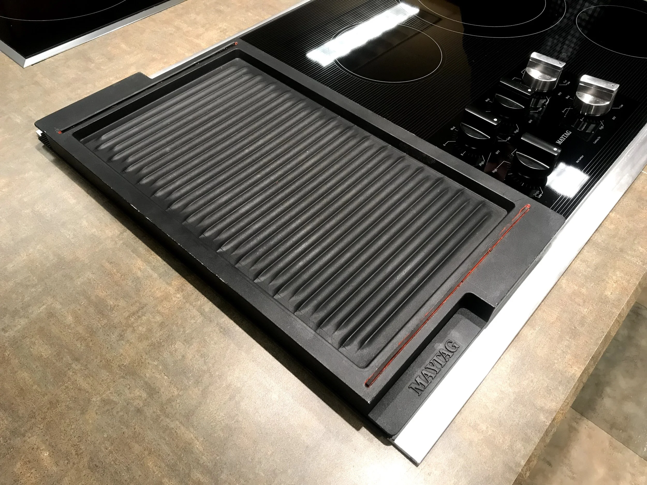
MAYTAG
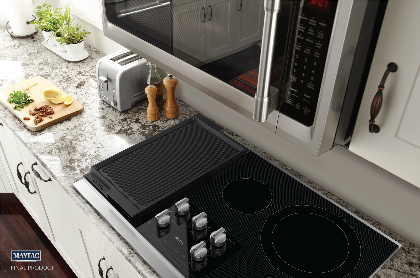
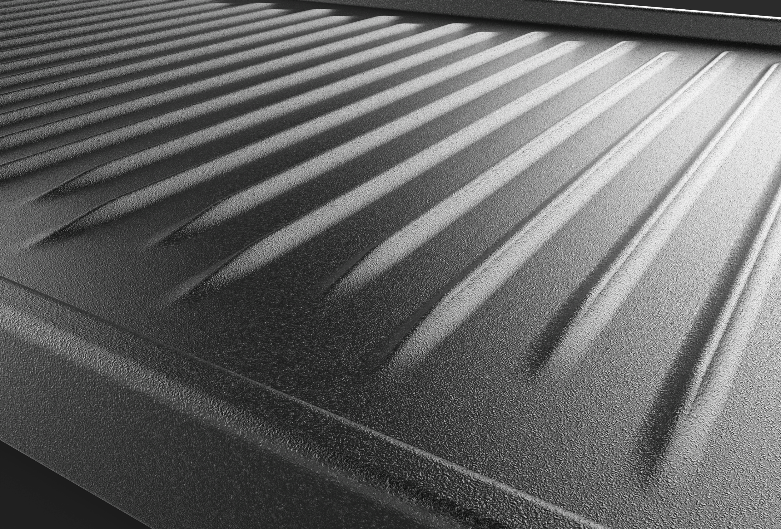
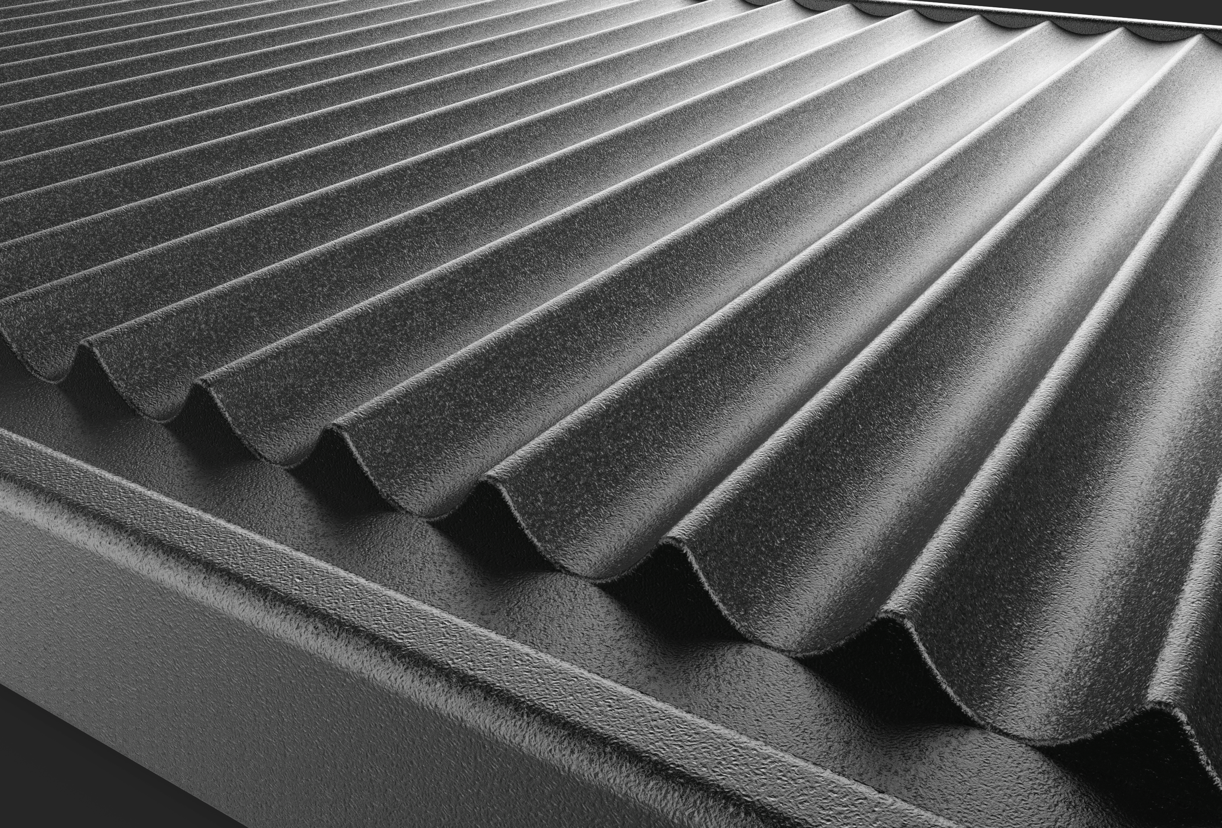
The focus on Maytag was to to upgate design language - trim and graphics - but especially to develop brand specific features and accessories. The Maytag brand's identity is focussed on no frill, objective and hefty design. We focused on designing a reversible griddle to go along with the cooktop. I directed this development, mostly form a form perspective, executed by our ID intern at the time.
FOCUS AREAS ID | USABILITY
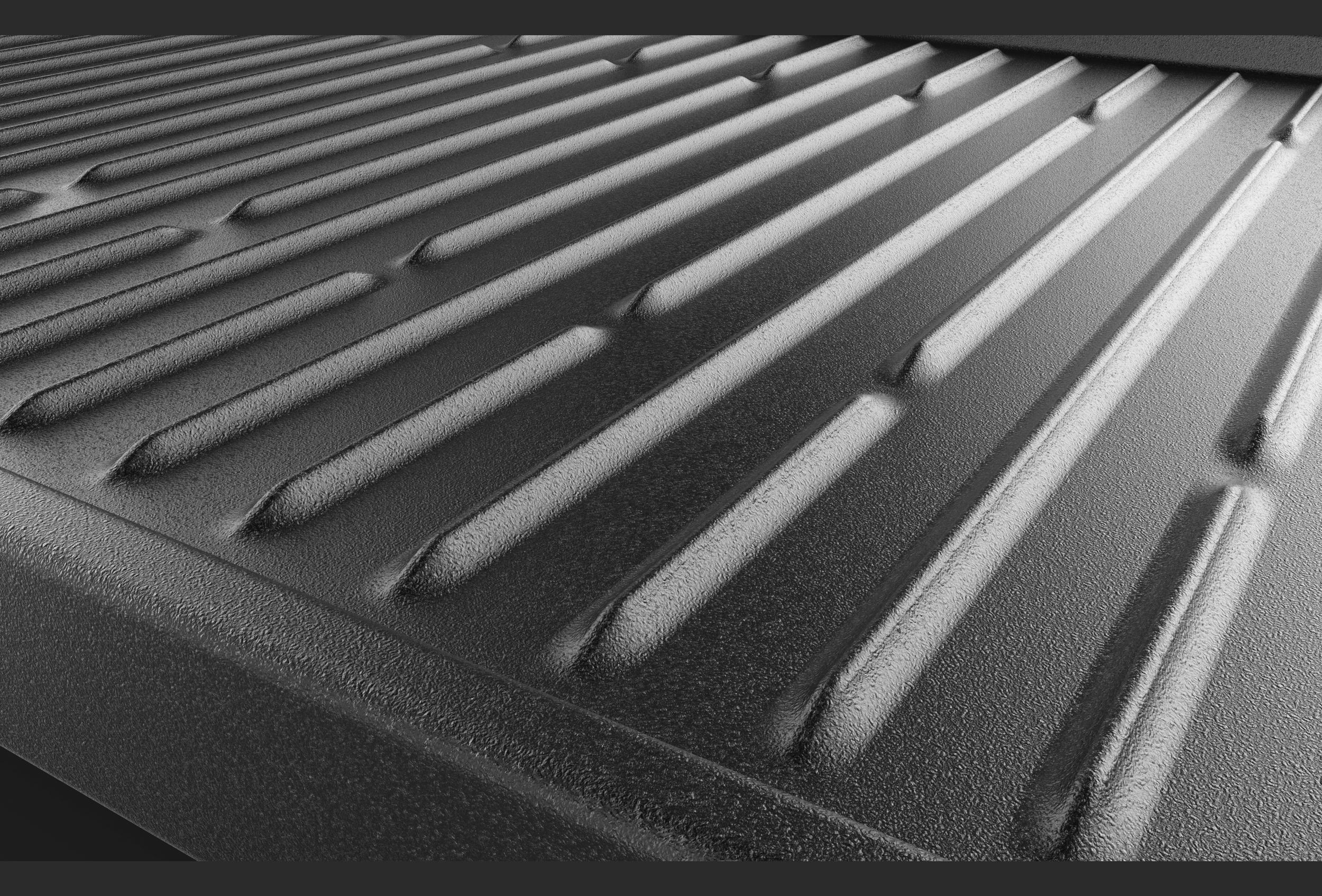
Griddle pattern exploration
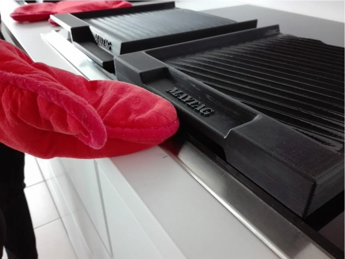
Usability evaluation
Engineering prototype